
Mobile Photography 101
Get the best images from Your next vacation.

The Subject
Before even starting to take a photograph, you have to ask yourself this single, most important questions: What Is Being Photographed?
Multiple things can answer this:
Main subject
Narrative
Texture
Colour
Light
Shape
Every image you take should have a clear subject. It doesn't necessarily have to be a person. It might be the way the light falls on a wall, the texture of old wood, the contrast between two colours, etc.
After identifying this, your every subsequent decision will be serving the purpose of Emphasising The Subject.
Composition
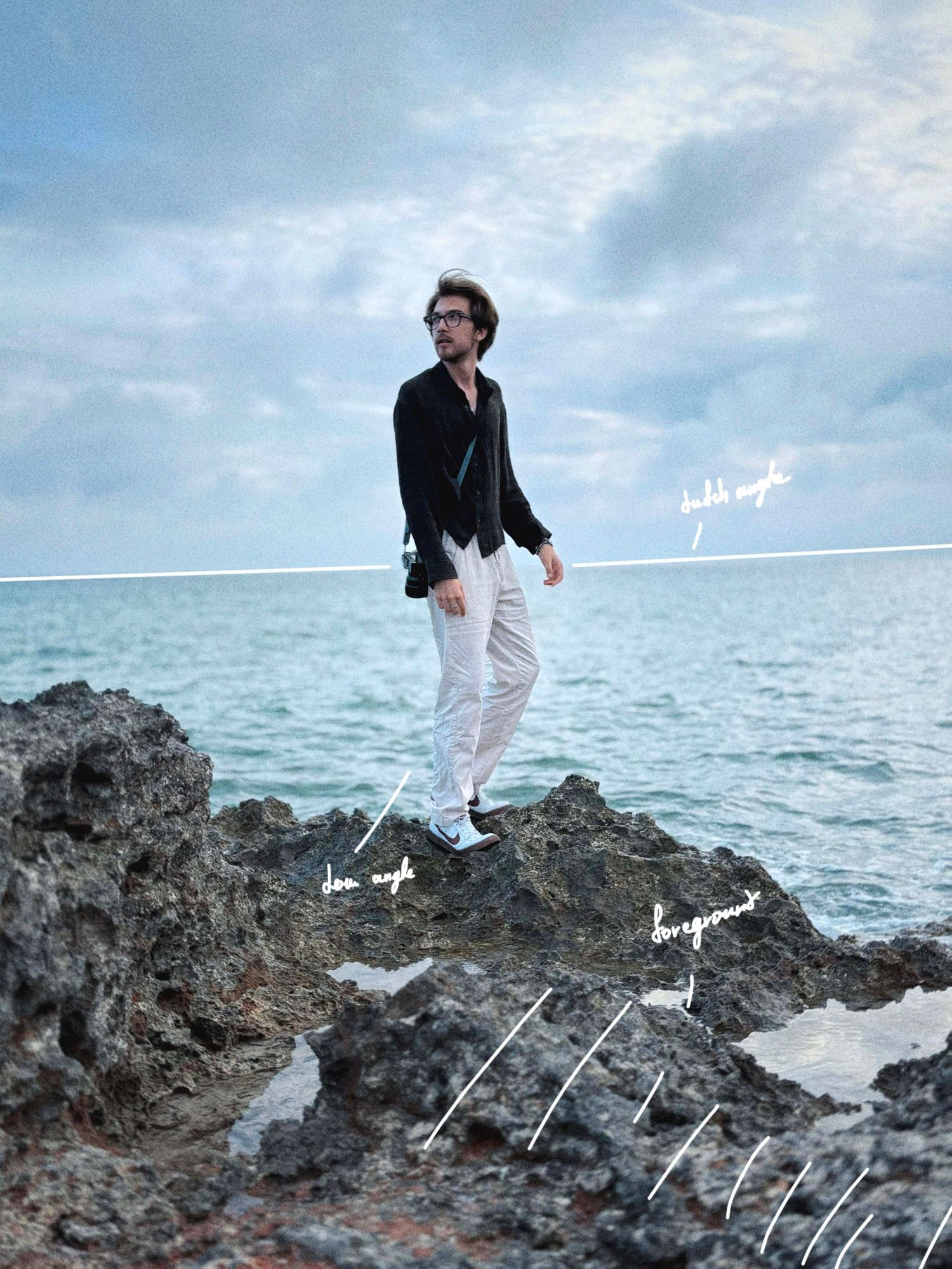
A Level Horizon is one of the first things the viewer notices. Unless a tilted horizon is intentional, what is called the Dutch Angle, keeping it straight creates a more balanced and natural image.
Centred Subject creates a balanced, and safe feeling, albeit it might seem a little blunt in places. To add tension try positioning your subject Off Centre.
Similarly, shifting the Horizon Line in relation to the subject can also be used for Dramatic Emphasis. For example, a low angle leads to a dominant and imposing frame, while the opposite might make the viewer feel trapped and powerless.
To add dimensionality, you can try Layering the image. The simplest way to do it is find a Foreground. This way, we have three distinct layers: The Foreground, The Subject, and The Background.
Here is an example of such techniques being used in order to impose a dramatic feeling:
A great trick I like to use when composing an image is The Blur Test. The easiest way to utilise this is to quint your eyes until the image is blurry. This helps to determine the Contrast Hierarchy and Subject Placement.
Making the image blurry or viewing it from a distance can also help you find the Distractions.
Distractions can be anything that pulls the attention away from the subject, and therefore breaking the harmony and continuity of the frame. The example of this may be a tree in the background 'coming out' of a person's head. Or, if you are shooting, say, a dark subject against a bright background, another dark element can reduce the immersion.
Leading Lines are abstract visual elements that guide the viewer’s eye through the frame, creating a sense of movement and direction.
Shooting landscapes or other scenes lacking a defined subject, you may try finding a Point Of Interest to anchor the composition. Examples of this could include a bird, a passer-by, a plant, etc.
Here is an example of a photograph using leading lines and point of interest:

A simple way to place your subject is using The Rule of Thirds. It divides a frame into 9 individual sections, and putting the subject across one of them helps balance the image. That said, despite the name, it is only a tool and not a rule, and the use of it is purely optional.
Another useful technique to remember if you want to make your photographs more engaging is Framing. It simply implies finding something to surround the subject.
There are many more composition techniques, and I do encourage you to learn more about it if you wish to deepen your knowledge of the topic. This only covers the basics I considered quick to learn and easy to apply directly on your phone.
Colour
Before starting to work on the colours, I like to scan the entire frame, and determine the Dominant, Secondary, and Accent colours. It really helps if they are either Analogous or Complementary.
Analogous means similar colours that sit close to each other on the colour wheel, like yellow and orange or blue and turquoise.
Complementary implies the colours residing opposite of each other on the colour wheel, such as red and green, or blue and orange.
And now, let's find The Outliers.
The Outliers are the colours outside of an artwork's natural colour scheme. It might seem too saturated or bright compared to the rest of the image.
Look at this example. Do you see how the paraglider's toxic green colour breaks the continuity of the pastel blue and orange colour scheme?
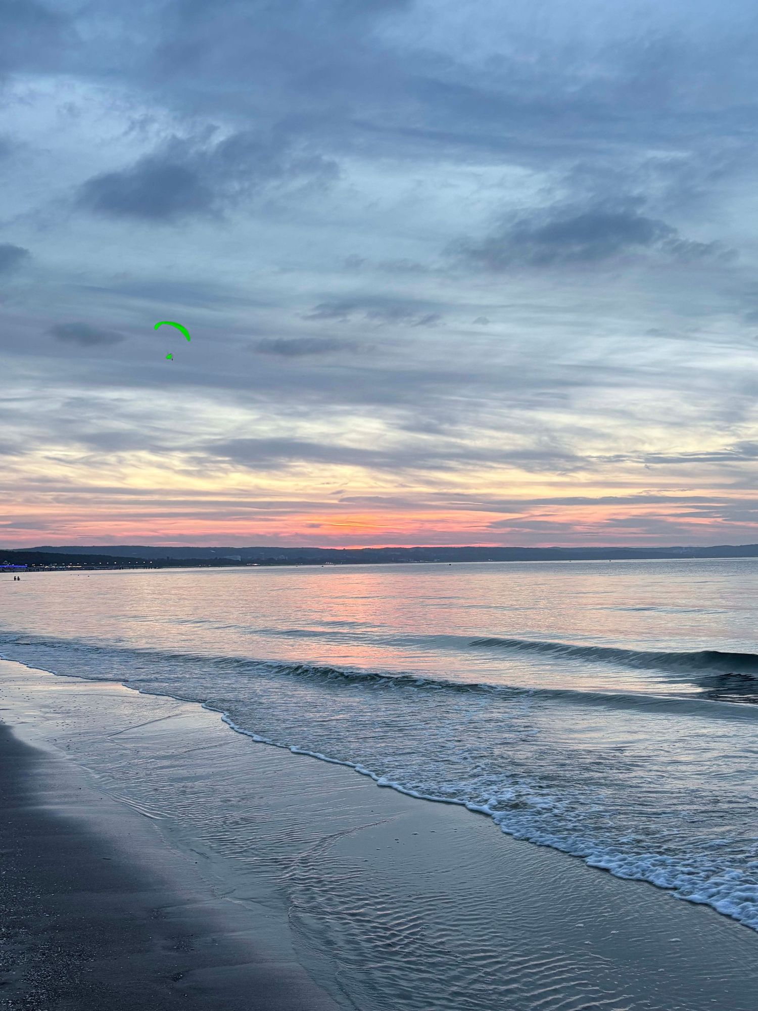

Compare it to the image on the right. Doesn't it just feel so much more harmonious?
To fix this, I like using the Colour Mix tab in Lightroom. Although sometimes, it might not be enough, and we have to utilise Masking or Remove Tool.
Photoshop can also prove useful for its more advanced abilities. Particularly, I advise you to look into Hue/Saturation adjustment layers.
After I'm done picking out the outliers and making sure the colours are consistent, I adjust the image using the same Colour Mix tab in Lightroom, finishing it up with Colour Grading.
Despite all of these possibly scary terms, every single tool and process described above follows essentially the same fundamental ideas of Colour Theory. I therefore encourage you to read about it in more detail, as it will prove highly useful going forward in your photography journey. It is by no means hard to apprehend, and I am positive that anyone with just a couple of hours of free time can get a hold of it.
Lighting
Lighting is the most crucial part of photography, and happens to be one of the hardest to master.
The fundamental qualities of light are Frequency (colour), Direction, Softness, and Intensity.
Frequency determines the colour or temperature. In natural conditions, it is dependent on the Sun's height in the sky. The higher the sun is, the shorter the distance its light rays have to travel through the Earth's atmosphere before reaching your retina. As a result, less of the shorter wavelengths are scattered, producing a more neutral, white light. The standard daylight temperature sits at about 5600k.
Direction determines the placement of Highlights and Shadows, and therefore affecting how we perceive Shape, Depth, and Texture. Front Lighting produces an evenly illuminated subject with very few shadows, while moving the light source to the side will result in a more textured and dramatic image.
Softness determines how gradual the transition is between Highlights and Shadows. The softness of light is dependent on the Size of the Light Source. Examples of soft lighting may be a large soft box or an overcast sky. Soft Light Source creates Smooth Tonal Transitions, reducing the appearance of harsh textures and imperfections. Harsh Light, on the other hand, creates Sharp Shadow Edged, strong Contrast, and reveals Texture.
To help you remember better, Soft Lighting is Flattering, while Harsh Lighting is Dramatic and Textured.
Editing and Software
And, finally, here's a list of the tools I am using. I know this is what you really came here for :)
Dazz Cam
Best app to give you a film feeling straight out of the camera. It's incredibly simple, and I use it for most of my snapshots.
Liit
An editing app created by the developers of Dazz Cam. I find it to be the best tool to give the polished iPhone photographs the imperfections that we all love film for.
Leica LUX
Similar to Dazz Cam, but it gives you more manual control and Leica-specific features. Great for BW Photography and grain textures.
Adobe Lightroom And Photoshop
Not sure if I should even say anything about them. The title pretty much speaks for itself.
Snapseed
An editing app made by Google. Similar to Lightroom, but simpler. Great for Beginners who are looking to get into photo editing but find the adobe suite seems too complicated at first.
Project Indigo
Free camera app from Adobe that allows you to shoot RAW and has a fully manual mode.
All of the images presented here were shot on iPhone 16 with no additional rigs, and edited using Liit and Lightroom. Since I use my phone for snapshots rather than professional work, I rarely, if ever, shoot RAW. It is mostly either Apple's own camera app with a custom Style (Cool Rose, Tone 14, Colour 40, Palette 100), Dazz Cam, or Leica Lux.
Hope you've learnt something new today! If you have, please DM me with the images you're most proud of that you took with my advices in mind. I would love to see all of them :)